Why?
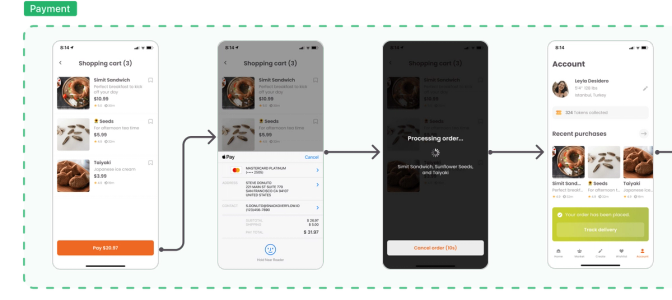
The more designs you have, the more difficult it is for teammates to understand their relationship. The designs you present should communicate the entire user experience so developers don't overlook conditional paths or uncommon use cases.
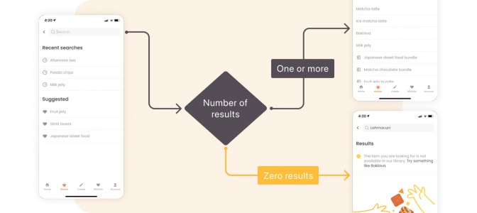
Harmony happens when everyone sees the same "big picture" of your user journeys with all scenarios represented in that picture — from the happy path (the ideal experience a user goes through) to an edge case a user might encounter.
Zeplin in action
Many tools can help map user flows, but most are the same: an open canvas with free-form arrows, shapes, and text. That infinite flexibility is also the biggest drawback, making large user journeys hard to document, maintain, and scale. Zeplin is a purpose-built user journey mapping tool that solves these challenges.
Flows
An open canvas with dynamic connectors, labels, and shapes for visualizing complete user journeys. Anything added to the canvas snaps into place, and any screen in your flows refreshes automatically with the latest published version.

Flow Groups
Remove clutter and organize your user journeys as they scale by grouping screens and flows into Groups with quick sharing links that are easy for the team to digest and reference.

Placeholder Screens
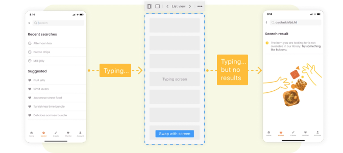
You can create flows with or without finished mockups with placeholder screens. Choose from several of the most common screen types of placeholder templates and simply swap in designs when the designs are ready.
