Why?
Most product teams use a design system to achieve a secure and consistent UI. Design systems also increase development efficiency. But an ongoing challenge is giving developers access to the correct elements and helping them build with the system as it continuously evolves.
Harmony happens when you centrally document your design system, where developers can access it during the build and clearly label all elements — including components, color, text, and spacing tokens — within your mockups. Surfacing your design system this way eliminates the guesswork of how developers should adopt it.
Zeplin in action
As a complement to your design system reference, Zeplin shows developers exactly when and where to use the correct elements. Zeplin labels approved components, colors, styles, and tokens across your designs and help developers cross-check designs with code — resulting in faster dev cycles and more cohesive product UI.
Highlight Components and Used In
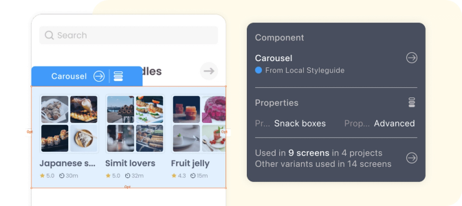
When inspecting a design, Zeplin highlights each component on the screen so it's easy to understand how they apply to the overall design. Developers can also uncover every instance you used a component — on individual screens and across projects.
Connected Components
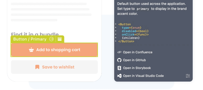
Connected Components allows developers to access components in their codebase right on the designs – with links to Storybook, GitHub, and any other valuable documentation for their workflow. After connecting components in Zeplin to your components in code, you'll see a helpful overview of the component when inspecting designs.
Storybook Integration
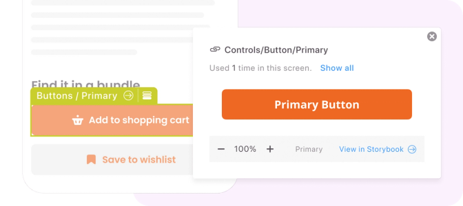
Linking Zeplin components to stories in Storybook enables a side-by-side visual comparison of components in Zeplin with their code counterparts in Storybook to confirm accuracy.
Colors and Text Styles
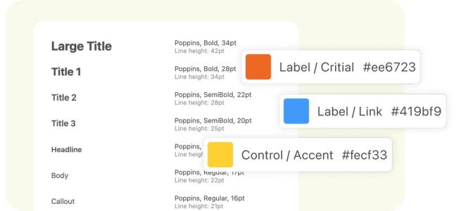
Keep style elements like colors and text styles organized, appropriately named, and easy to access right on designs.
Design Tokens
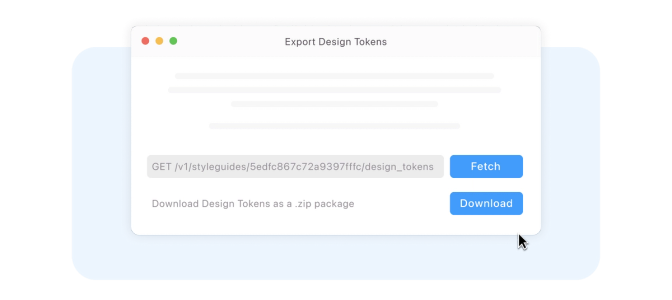
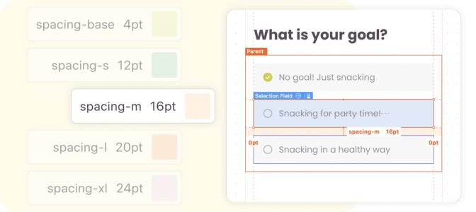
Zeplin automatically generates design tokens for colors, text styles, and spacing and keeps values centrally documented and up-to-date in Styleguides.
Token Export
Developers can export color, text, and spacing tokens directly from Zeplin in various formats.
